Communications

Letterpress was the motto for seven communications. From the presentation of projects to work methodologies, from personal research to academic work. A contemporary practice and research perspective.

10 October 2019

Pedro Amado
Vitor Quelhas
Catarina Silva

Faculdade de Belas Artes da Universidade do Porto / i2ADS
Instituto Politécnico do Porto / ID+ / uniMAD
Instituto Politécnico do Cávado e do Ave / ID+
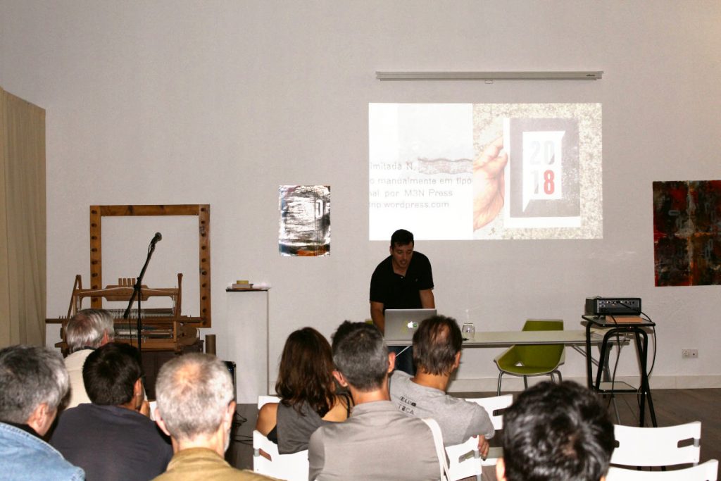
This article is a characterisation of printers, typographers, and Portuguese designers that have kept alive the traditional activity of printing with moveable type, either traditionally or combined with other techniques. The two principal categories that we have identified, which can be found in three different generations, demonstrate that traditional typographers and graphic designers work together to keep alive, explore and develop this activity.  

In the last decade, letterpress printing has become increasingly attractive, especially for graphic designers, as they discover and explore its visual and material properties. The main problem is that the information and knowledge that are necessary to learn this craft are dispersed and scarce. Practical manuals on letterpress are sold out, non-existent, or are difficult to find. The tools and materials used to print are not easy to find because many schools eliminated them. Even when available, the operating instructions are difficult to understand without the assistance of a qualified typographer. Nationally and internationally, the active population of letterpress compositors and printers has diminished considerably. It is urgent to preserve the cultural heritage of this specialised craft.  Hence, the principal objective of this presentation is to offer a summary of the traditional print shops still operating in Portugal. 

Based on documental sources and previously obtained empirical knowledge, we elaborated an initial sample of these print shops and ateliers. We amplified our findings and displayed them in a snowball sampling format during the interviews. We conducted semi-structured face-to-face interviews, which we divided into four distinct dimensions: workshop/characterisation of the author; typographical printing process; education/training, and references. Two aims guided our inquiry: to characterise each workshop, equipment, and experiences to be shared; to elaborate educational guidelines based on the profile of each workshop that will be shared with students, professionals, and enthusiasts.  The analysis of the interviews that were conducted revealed the existence of three generations of two types of professionals and workshops that expressed an interest in preserving the letterpress craft: professionals with a traditional letterpress training (Example: Tipografia dos Anjos); self-taught and traditional (Example: Tipografia Dias or the collective We Came from Space) graphic designers. 

Despite the generational schism and the distinct origins of the interviewees, all expressed an interest in preserving and recuperating this know-how through the practice and exploration of the letterpress techniques.  In sum, more than a tendency or a rebirth, there is an active nucleus of professionals that are interested in preserving and sharing the lexicon and knowledge of the traditional, and more recent letterpress practices, with the next generations.
10 October 2019

Roberto Gamonal Arroyo

Facultad de Ciencias de la Información 
Universidad Complutense de Madrid

De la tipografía modular
a las plantillas tipográficas

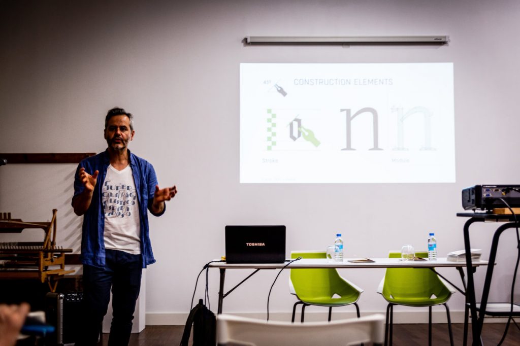
El diseño de una tipografía es un proceso complejo. Pero sigue una lógica que se puede formalizar mediante elementos constructivos como el módulo. Este puede responder a una apariencia basada en los trazos creados con una herramienta o en formas geométricas ya estandarizadas.  A partir de una selección de estos elementos se pueden establecer una serie de acciones como la repetición, supresión, sustitución, rotación, inversión y superposición que nos permiten poder crear cada uno de los caracteres usando unas formas preseleccionadas.  

Esta lógica constructiva ha sido aplicada desde siglos atrás para la enseñanza de la escritura caligráfica, para la creación de patrones y ornamentos y posteriormente en la estandarización de la letra mediante la tipografía. Algunas de estas formalizaciones se realizaron en las primeras décadas del siglo XX al calor de los movimentos de vanguardias a través de tipografías modulares en plomo (con las restricciones técnicas que ello conlleva). Un recorrido histórico por estos acercamientos a una tipografía ornamental y experimental y el posterior análisis de los ejemplos más emblemáticos nos ha llevado a realizar una propuesta de actualización de estos sistemas tipográficos mediante varias plantillas o stencils que mantienen el espíritu analógico y creativo con el que originalmente fueron diseñados, pero con un uso más sencillo que el manejo de tipos de plomo. 

La primera plantilla realizada está basada en el Super Tipo Veloz, una tipografía modular española creada en 1942 por Joan Trochut para la fundición José Iranzo. Gracias a que se pudo disponer de la tipografía original en plomo, se realizó un estudio exhaustivo de sus más de 300 módulos para sintetizar en una selección final de 68 módulos y diseñar una plantilla mucho más fácil de utilizar. Tan sencilla que incluso ha sido probada en talleres con niños con unos resultados sorprendentes. La siguiente plantilla diseñada se ha basado en una tipografía italiana llamada Fregio Mecano, creada en la década de los años 20 y comercializada por la fundición Nebiolo. Se trata de un sistema modular bastante más sencillo compuesto por 20 piezas.  La última está fundamentada en diversas tipografías cuyos módulos están basados en formas geométricas básicas como el círculo, triángulo y cuadrado, además de sus respectivas subdivisiones. 

Son ejemplos de estas características la Elementare Schmuckformen de la fundición Stempel AG, la Futura Schmuck de la fundición Bauer o las Figuras Geométricas de la Fundición José Iranzo.  Estas plantillas, además de repasar hitos históricos de la tipografía, son un excelente instrumento para entender la construcción de la letra permitiendo múltiples combinaciones y variaciones a través del dibujo de forma lúdica y sencilla.

11 October 2019

Rita Carvalho

Delli 
Universidade Lusófona de Humanidades e Tecnologias

In this presentation, I wish to talk about the utilization of printing with moveable type in proof press in the teaching of Design, more precisely in the context of undergraduate (BA) studies in Communication Design (Del li-Lusófona).  With this end in mind, I shall describe two projects developed in our workshops.

AAAAAARGGH! (2019)

This project explores simultaneously the acoustic dimension of typography and the physicality of wood and lead types. This experience (A six-hour workshop) resulted in a grouping of foldable onomatopoeic creatures, whose bodies are the impression of the sounds they emit, a kind of concrete poetry.

Coffee  (2018)

Besides introducing students to this technology, we sought, in this 18-hour workshop, to work with letterpress printing in combination with drawing, with Coffee as our general theme. Taking our cue from texts about coffee from different authors (Raymond Carver, Paul Francis Webster, Otis Redding, etc.), we produced a publication (a miscellaneous collection of small posters, foldable prints, and postcards) in which the printed word, combined with drawings, embodies the concepts and emotions of coffee as an element of daily life.

11 October 2019

Robert W. Oldman

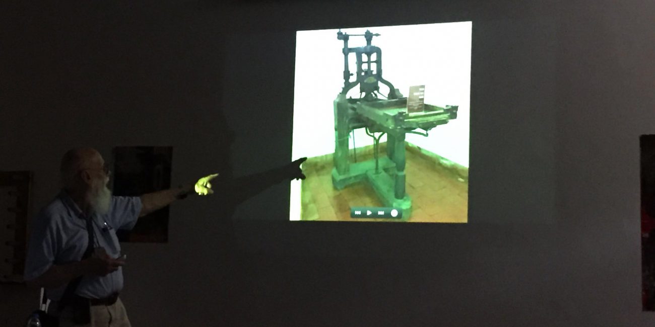
I have been studying the printing press that has been in the Biblioteca Joanina at the University of Coimbra, and will soon, I hope, be traveling there to assist the Library in restoring and exhibiting the press in a more secure way. The press is first recorded as having been made or worked on in 1845 by Manoel/Manuel Bernardes Galinha, a Coimbra ironworker. It is unique among European presses, as far as I know, in that the main frame, or staple, is made of wrought iron, instead of the usual cast iron or wood. The staple sits on a wooden base.

The reason I find the press so interesting is that it closely resembles a printing press invented in 1772 by the Basel, Switzerland type founder Wilhelm Haas, but it was not successful at that time due to a conflict with the guild of printers. However, in 1784 his son became a printer, and had a strengthened version of his father’s invention built for his use. Because the description of the improved version is vague, it is difficult to compare it with either the original of his father or with other presses, but his described improvements, as well as the similarities with his father’s press, fit the characteristics of the press in Coimbra. Thus I believe it is possible that the Coimbra press is in fact the press built in 1784 by Wilhelm Haas the son, and as such it would be the oldest iron hand printing press in the world. If it is, it also was apparently the inspiration for the iron press introduced in England about 1800 by Charles, 3rd Earl Stanhope, and known as the Stanhope press.

I would like to present information about the press itself, as it is very interesting in its own right, as well as the evidence I have found for its possible earlier origin. The press is a very important one regardless of its origin, as it appears to either be the oldest iron press in the world or the only iron hand press known to survive that was made in Portugal. In addition, it has had wide use in Portugal, about which more needs to be known. I feel that bringing it to the attention of letterpress printers in general may result in more information coming to light.

12 October 2019

João Lemos
Margarida Azevedo

ESAD Matosinhos

BORDERS (Limites)

The frontier is the demarcating line that defines and differentiates the exterior from the interior, determining what is inside and outside, defining the finite and tangible nature of territories, restricting and limiting them. Typographical projects and works presuppose concrete materiality, a physical context, and the definition and contextualisation of a conceptual territory, which transcends, as a consequence of the author’s imperative necessities and propensities, his/her circumstances, conveniences, tools, and transgressive nature, delineating his/her limits and frontiers. By establishing a limit that defines and determines the reading of the camps that it separates, camps that might be antagonistic or paradoxically complementary.

The frontier thus acquires a role and visibility that converts it into the object of reflection. In this specific context, the frontier constitutes itself as an object of reflection concerning the technology that has defined and configured the spaces of conceptualisation and construction of the typographical design. A territory that is constituted by the forms and counter-forms that characterise the world of things, expressing ideas and ideals that represent the tangible and the intangible. Digital technology has expanded the notion of type design into hybrid territories, wherein mutation, animation, and color transmute the design of the typeface in multiple forms.

Despite the antagonistic spatial positions, the sides of the frontier constitute themselves as a unique space, containing the same information and sharing the same context, even though they may be understood idiosyncratically as different, strange, and alien. The notion of a frontier that divides the digital from the analogical, reflection from emission, the material from the immaterial, thus separating concepts and experiences, is refuted by the sharing of information in a shared conceptual territory. Where do these limits position themselves? How do they define themselves? How do they determine their design?  The 10ET Typography Meeting, hosted in Portugal, is an annual and itinerant international scientific event that takes place in different national institutions of design, gathering researchers, professionals, teachers, instructors, students, and partners. It features conferences and presentations of works that were evaluated and selected by peers (Peer review), as well as workshops and expositions. Its purpose is to gather the principal contributors and projects in the domain of type design, thereby divulging high-level research and technical knowledge to foment the learning and critical thinking that will contribute to a fruitful  discussion and to the development of ideas regarding the design of typefaces.

The 10th edition of this meeting will take place in the city of Matosinhos, Portugal, on the 21st, 22nd, and 23rd of November 2019. The meeting will be organised by ESAD, Escola Superior de Artes e Design (Higher School of Arts and Design), and ESAD-IDEA, Investigação em Design e Arte (Art and Design Investigation). The theme of this year’s meeting is BORDERS (Limites), a theme that we believe is relevant in the present international context.

12 October 2019

Luís Moura

Coingra

My name is Luis Moura. I started working in graphic arts in 1984. I began my career working at the print shop of the newspapers Açoriano Oriental and Açores, then called Impraçor. Later, the company separated the graphical section from the editorial section, and, in 1992, a new company was formed, Coingra, where I presently work as one of the persons responsible for graphical production.

I would like to say, as a caveat, that I do not consider myself a typographer since I have not worked as a compositor or printer but rather in the graphical area. I would like to speak about a project that involves typographers, designers, and graphical artists for the creation of an Association in the Azores that includes the greatest number of persons from various islands. Its purpose is the recuperation and preservation of old letterpress equipment of great historical value. 

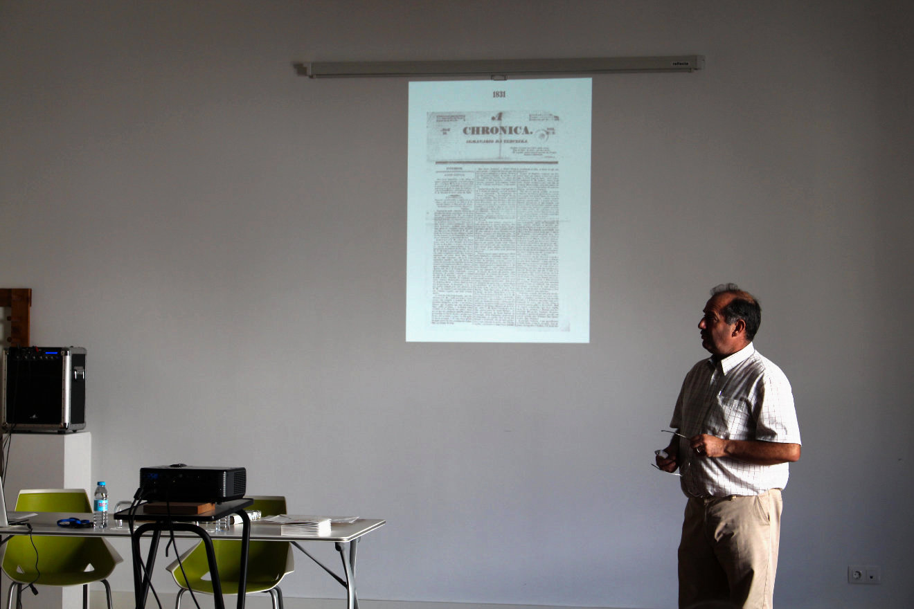
My passion for printing was formed when, as a child, I came into contact with print shops and with the printing of newspapers. My father, a journalist that passed away recently, wrote for the newspaper Correio dos Açores. We, his sons, accompanied him to the newspaper. While he was writing his chronicles, we would hang out in the machines’ room.  At the time, I remember it perfectly, as if it were today, the first printing sample would be placed in a box with a heat source under a net, so that the ink would dry and it would be possible to revise the articles and then proceed to the final printing of the newspaper. I was eight years old. Moving ahead. I would like to emphasise that print shops played a very important role in our islands. Why? Given our geographical discontinuity and, of course, the related difficulties in communication, most islands were isolated from each other. For this reason, newspapers were established to report on what was happening then. This lead to the creation of print shops on the islands. An interesting historical fact: we have printed more than eighty newspapers. For example, the newspaper Açoriano Oriental is the oldest Portuguese newspaper and the second oldest in Europe. It is printed in the print shop I work at, Coingra. I can show you some newspapers already published.  Returning to the beginning of my presentation, I wish to emphasise the importance of print shops, their quantity, and the fact that I have been working in this field for some years.

I should also mention that I have witnessed the destruction and abandonment of printing equipment, with much of it ending in junkyards. This is the reason why I have spoken with colleagues with a view to the establishment of an association that involves the oldest and true typographers as well as graphical artists and designers, such as Júlia Garcia and Rui Lopes… In the context of this project, I wish to thank Dr. Carla Bretão, of the Angra Diocese, which has published three newspapers, the Correio da Horta, União, and A Crença, that you have visited and which continue to the published.

I would also like to thank: Mr. Paulo Soares, Gráfica Ferreira e Soares (Ferreira e Soares Print Shop), City of Horta; Mr. João Pacheco, Tipografia Esperança (Esperança Print Shop); Mr. Dinis and Mr. Eduardo, Tipografia Micaelense (Micaelense Print Shop); Mr. Ernesto, Nova Gráfica (Nova Gráfica Print Shop); Coingra Print Shop. If I am forgetting someone, my apologies. I wish also to thank the City Hall of the Municipality of Ribeira Grande for providing the venue for this small Graphic Museum.

12 October 2019

Joana Monteiro

Clube dos Tipos

To remove weight from lead: contemporary methods for working with moveable type

Based on recent works, I shall present a methodology for working with moveable type that involve, sometimes, using letterpress in a way that is not necessarily bound by its limitations.

Letterpress Today


When we enter a letterpress workshop and open the cases of a cabinet, we are presented with immense visual riches. When these are combined with the techniques that are available today, this may lead to new graphical approaches. The use of wood and lead types enables that the printing of a single impression with the help of a proof press and posterior digitalisation, could be freely worked on, without being restricted by traditional letterpress techniques. It is also possible to make use of a typographical composition in a printing plate, whose image is captured by a photographic camera. This image is then digitally manipulated and used as the basis for other graphical elements that will be printed by offset or digital methods or, as the case may be, only in the creation of digital images that will be disseminated in the internet.